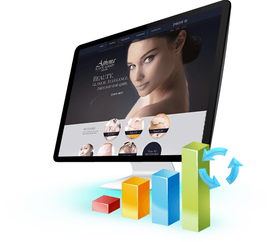
Responsive
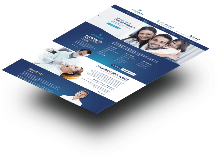
Medical Website
Design
WHAT IS IT?
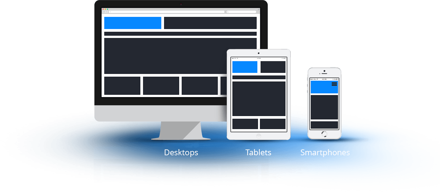
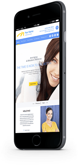
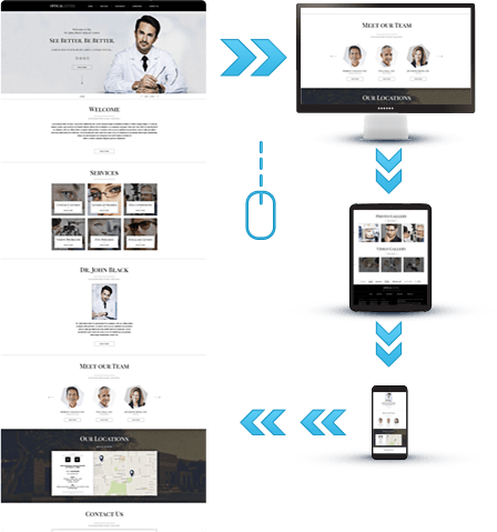
Responsive Website Design automatically adjusts your website for tablets and mobile devices resulting in easy reading, navigation, and browsing with minimum need for resizing, panning, and scrolling.
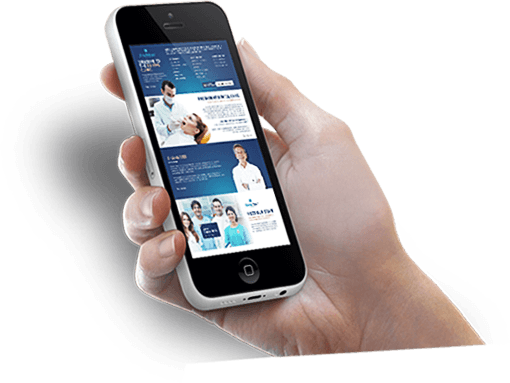
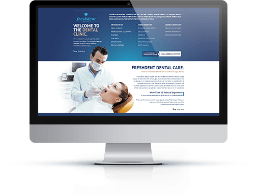
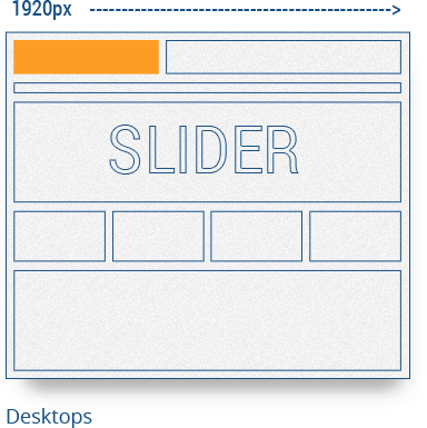
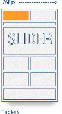
One website for all devices and browsers: PCs, Macs, Laptops,
Tablets, Smartphones.

One website for all device types and all users


WHAT ARE THE BENEFITS ?
WEBSITE OPTIMIZED FOR
MULTIPLE DEVICE TYPES
MULTIPLE DEVICE TYPES

NO NEED
TO ZOOM ON SMALLER
DEVICES TO READ CONTENT
TO ZOOM ON SMALLER
DEVICES TO READ CONTENT
IMPROVED SEO
ONE WEBSITE - ONE URL
ONE WEBSITE - ONE URL
BETTER USABILITY &
HIGHER CONVERSION RATES
HIGHER CONVERSION RATES
Why Should
You Care ?
You Care ?


Medical Marketing Blog
Promote your practice with our expert medical marketing tips, insights and tutorials.


MOST RECOMMENDED and top rated
medical website design AND healthcare marketing program.
"WebToMed™ offers a unique combination of creative, marketing, technology and business know-how."

For Medical Practices
For Health Companies
- Healthcare Website Design
- Medical Application Development
- Search Engine Optimization
- Pay Per Click Advertising
- Medical Content Marketing
- Social Media Marketing
- E-Mail Marketing
- Medical E-Commerce
Contact
- WebToMed, L.L.C.
1515 S Grove Ave, #3637
Barrington, IL 60011
Copyright © 2001 - 2026 WebToMed™, L.L.C.
All Rights Reserved.
All trademarks used are the properties of their respective owners.
All trademarks used are the properties of their respective owners.